As described in the overview, Conditional Formatting (CF) allows users to highlight important items in a visualization using mathematical or logical rules and graphical adjustments to the underlying chart or grid. Conditional formatting is a powerful feature because it will dynamically adjust and change based on the query driving the data. And since these queries will change or morph based on user interactions (via slicing, dicing etc), the formatting will dynamically update itself in lock step.
Logic Venues
The mathematical logic driving the formatting exposed includes
- Out-of-the-box formulas and frameworks that work without much intervention
- User configured adjustments to out-of-the-box logic
- Full function, and highly flexible user-defined logic
- A mixture of the above choices
The permutations of logical constructs are almost endless.
The use of these different options depends on what triggered or generated the formatting:
- Context Menu Conditional Formatting offers a quick, easy point-and-click set of capabilities using out-of-the-box logic with predetermined mathematical settings and format choices.
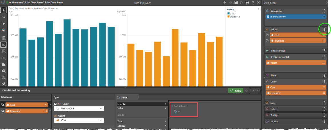
- Drop Zone Conditional Formatting offers a quick, drag-and-drop set of capabilities that gives the user more control over the measure source and target, format choices and multiple mathematical treatments
- The KPI Designer (in Formulate) offers tremendous control over the mathematical treatments with specific control over the formatting. The Quick KPIs offer access to such functionality as well.
- The Conditional Formatting Dialog, centralizes all the above functionality and gives the user granular control over the mathematical settings and formatting options. Note that the mathematical formulations used still need to be edited separately in the Formulate tools.
Since the permutations and opportunities for defining any mathematical logic and construct are endless in the Formulate tools, the topics below will only cover the out-of-the-box options.
Logic Definitions
The Built-in logic definitions for Conditional Formatting fall into four categories. The first two apply to colors only, while the last two apply to both colors and indicator graphics. Some of the explanations are highlighted in the grid below:
Specific Colors
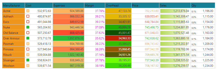
This option will hard code every data point in the target measure with a specific color. An example is shown with margin above which is set to a specific color of fuchsia.
This capability is sometimes used with putting 2 measures in a chart, and needing a color driven technique to differentiate them. Users can use the dialog box to set the format to a specific color. Note that this can also be done via the drop zones or using the "colorize" option find in the drop zone menu (green circle).
Value driven Colors
This will read the value from the measure driving the coloring logic and use it as either an actual RGB or HEX value to determine the cell's color. An example is shown above for Overhead. This functionality is incredibly powerful, since it allows users to define ANY logic to drive color directly, without any other mathematical overlay.
- Click here for more on Value driven Color Formatting.
Bands - Discrete Colors or Indicators
Banding logic allows users to define discrete "trim points" or bands into which values in the query are assigned. Then each band can be assigned a specific color or graphic indicator.
Fixed
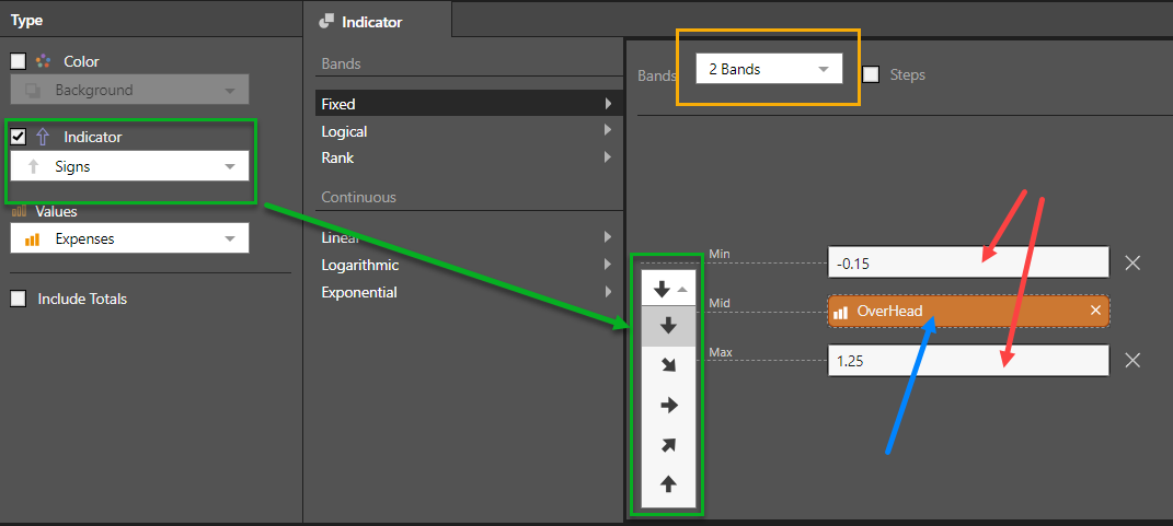
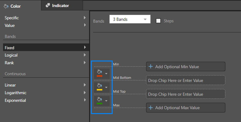
The fixed banding framework allows users to choose the number of bands (2,3,4,5) and for each band to define the trim points with hard coded static values or measure chips to drive dynamic values. The measure chips can be dragged and dropped into the dialog's drop zones (red and blue arrows below).
KPIs defined with the KPI designer in Formulate are usually paired with measure driven fixed bands to drive the graphical outcomes - affecting both color and indicator. When the KPI is deployed in Discover, the fixed bands are auto-populated with these different measures driving the band trim points.
For indicators, the type of indicator dictates the shape options in the band logic and its adjustment (in this case arrow rotation).
For colors, the bands are defined by different color choices. The colors are initially driven by the underlying report theme. However, users can click on the color pickers and define their preferred colors for each discrete band.
Optional Min and Max
The Minimum and Maximum values in fixed bands are technically optional since the graphic engines will apply the formatting to any numbers below the minimum and any numbers above the maximum, regardless of the trim point values supplied. However, when drawing gauges, the use of these 2 values are required to determine the start and end of the graphical scales added to the gauge visualizations.
Note: When using Conditional Formatting, when Min and Max values are not configured, the system will automatically select the Min and Max values from the entire column range. If there is only a single value in the range, it is suggested that users add a value of "0" as the Min.
Fixed Banding with Steps
The Fixed Banding can be extended using the "Steps" checkbox.
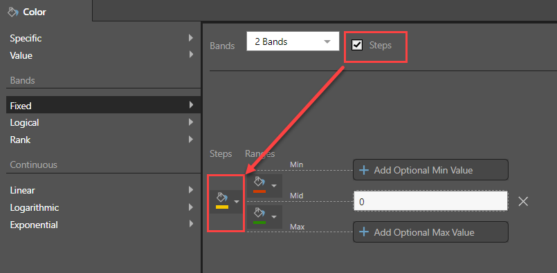
Users can specify a particular color to assign to the absolute value of the threshold at which one band transitions to another. For example, a two band conditional formatting, assigning red to negative values and green to positive values, could assign another color to the value zero, thus identifying values which fall precisely on the threshold boundary.
Note that the quick formatting "positive / negative" option does not support Steps. A two band system must be applied as above.
Logical
The logical banding framework allows users to employ mathematical rules to define the trim points based on the values in the source measure rather than provide hard coded or calculated values. Most of the logical bands are usually split into a simple two-band model (but not always).
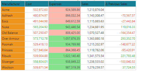
The grid above shows different examples, which are explained further below.
Average
The average logic simply groups the values into above or below the average of the numbers in the data cells of the rule. So for Expenses (above grid), the average is 927,039. All numbers below this value are red. Anything above is green.
Percentile
The percentile logic places all values below the specified percentile into one band, and all those above it into another. So for Cost (above grid), the 50th percentile (or median) is 532,972. All numbers below this value are red. Anything above is green. Users can provide their own percentile when using the option.
Standard Deviation
There are three varieties of standard deviation logic available:
- Standard deviation: Places all values WITHIN the specified standard deviation into one band, and all those OUTSIDE of it into another.
- Above standard deviation: Places all values ABOVE the standard deviation into one band, and all those BELOW it into another.
- Below standard deviation: Places all values BELOW the specified standard deviation into one band, and all those ABOVE it into another.
In each case, the user can provide their own standard deviation value and the colors to apply when using the option.
Positive Negative
The positive / negative logic simply flags all values below zero into one band, and all those above zero into another. For example with the Previous Sales measure (grid above) - all numbers below zero are red. Anything above is green.
% of Max
Each of the data point values are graded against the maximum value in the data point list. The formatting is then applied with a graphical adjustment in proportion to the grade. This functionality is normally associated with Data Bars and Text indicators only.
Percentage of Total
Each of the data point values are graded against the total value of the data point list. The formatting is then applied with a graphical adjustment in proportion to the total. This functionality is normally associated with Text indicators only.
Value
This is not really a scale or band. Instead, the actual value of the item driving the conditional format value is displayed as is. This functionality is normally associated with Text indicators only, where users elect to show 2 values per cell in a grid, side by side.
Rank
The rank banding framework allows users to create simple percentile trim points based on the number of bands and then assign the data points to those bands based on their ranked position in the list - from high to low. The assignment to the bands can be either value-order driven or rank-order driven.
In the grid below, a tri-band model is used, so the data points in the grid are split across 3 bands. Each column is using a different technique (explained below).
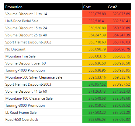
Order By Value
When using the "order by value" rank, the items are ordered by their values. The value is also used to determine the trim points. So in the example above, Cost is ranked by value across 3 bands. The trim point for the first band is 346,615.94 [ ((max-min)/3) + min) ]. So the first 2 values are below this value and show red. The next trim point is 370,155.98 - so the last 6 items exceed this value and show green. Everything else in the middle shows yellow.
Order By Rank
When using the "order by rank" rank, the items are ordered by their values. However, their POSITION in the order is used to determine their allocation to each band - which will be made up of an equal number items per band. So in the example above, "Cost2" is ranked by value and then evenly allocated across 3 bands. So the first 6 items are flagged as red, the next 5 as yellow and the last 5 as green. (The imbalance between the bands is because the 16 items cannot be split perfectly by 3).
Continuous - Gradient Colors or Indicators
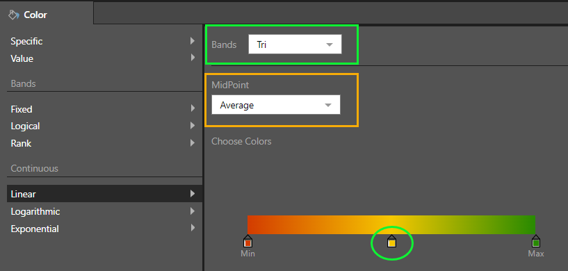
The continuous logic does not band items into discrete colors - rather it plots the data point on a color gradient scale in proportion to its position on that scale. For example, a data point (or cell), that is 65% the way between the lowest value in the evaluation set and the highest value will get a color that is a "65%" of the way between the start and end color. Likewise, if the formatting is related to graphical indicators then the adjustment may change a variety of graphical settings depending on the target icon - for example the length of the bar, the angle of the dial or the rotation of the arrow.
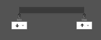
The logic of the scale; the start and end colors or icons; and the optional logic of the midpoint are what can be configured in the dialog for continuous conditional formatting. There are 3 basic mathematical treatments for the scale: linear, logarithmic and exponential. The options are common to all 3 scales and allow users to change the number of bands (2 and 3) and pick the mid point algorithm: either "average" or "percentile" (for 3 bands only).
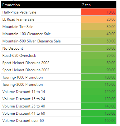
Linear
The linear scale plots things evenly from the start to the end point - values are plotted on a 1:1 basis.
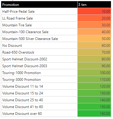
The effect of the linear scale, using a 3 band and average midpoint option, is shown below on the background colors of the first column.
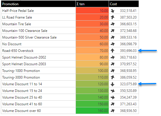
Like colors, users can show indicators with a continuous scale as well. Instead of start and end colors, users need to pick the start and end position of the built-in indicator icons. The effect is shown above for Cost, with the arrows pivoting on different angles from 0-180 (as per the settings below). Note the highest and lowest values are pointing up and down respectively.
Changing the mid point logic for the above linear scale, using percentiles and moving the percentile point for the middle color to 25%, the entire framework for the scale can be adjusted to show a completely different outcome.
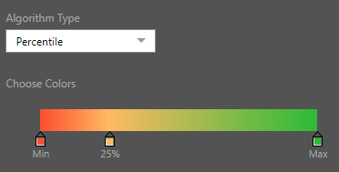
The grid below shows a 3 band linear scale, with the mid point set at the 25th percentile point.
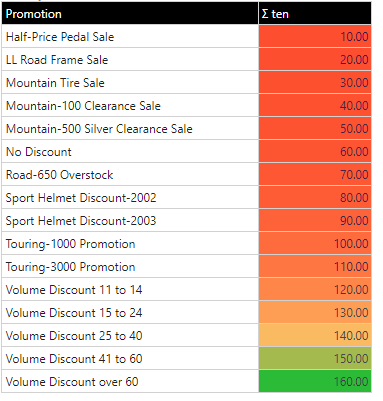
Logarithmic
The logarithmic scale plots things using a log scale from the start to the end point - but values are plotted on a 1:Log10 basis. This creates a flattening of the curve as the values increase, effectively accentuating the smaller values. The logarithmic scale can also be used in tandem with the percentile logic for other variations.
This uses the same dataset as the above linear examples, but the upper values are bunched together (mostly green), while the lower values are separated out into their own, more distinct colors.
Exponential
The exponential scale plots things using an exponent scale from the start to the end point - but values are plotted on a 1:Exp basis. This creates a growth of the curve as the values increase, effectively accentuating the bigger values. The exponential scale can also be used in tandem with the percentile logic for other variations.
This uses the same dataset as the above linear examples, but the lower values are bunched together (mostly red), while the upper values are separated out into their own, more distinct colors.
Handling logic for specific Cells
To make the conditional formatting easier to configure, and applicable to a subset of data cells (rather than entire measures), the HasDataPoint PQL function can be used to tell the system which data cells should be included in the CF logic rule.